During
the introduction of the first issue, we saw that the stamps were printed in
sheets of 240 pieces (4 groups of 60). To keep separated the various stereotypes
one from the other and to give stiffness to the printing composition thin
blades, probably metallic (but somebody advanced the hypothesis of wood material,
but it looks difficult to believe), were placed between each sample, both
in horizontal as well as vertical directions.
These thin separating blades, called also "typographic spacing",
were not of the same height as the stereotypes, but below their level. Nevertheless,
due to the heavy usage of the plates and to the shots they received during
the printing process, sometimes some of them got shifted from their place
with the tendency to align themselves along the printing surface.
For this reason, when the inked plate was placed on the sheet of paper for
printing, the blades too left their marks on the sheets, sometimes very lightly,
other times in a very evident way.
Here it is that sometimes it is possible to find colored rows in the white
margins between stamps.
These marks, quite in great demand and not so common if very evident, are
found both in horizontal direction as well as, much less frequently, in vertical
one. They appear more frequently in the first printing runs.
It has been observed (Pietro Provera "I classici di Austria a e Lombardo
Veneto", on Filatelia, nr. 20/1965) that are much more frequent on
plates where the stereotypes defects are more present, may be because those
plates was subjected to a major printing stress. In addition the vertical
marks are visible only on parts with "large spacing" (see
the related "Going Deep") probably because they were not
present on the ones with "narrow spacing".
The thickness of these marks is not constant, also because they are very often
a bit smeared and irregular: it's about 1 to 1.5 millimeters. Even the shape
of the mark is not always the same: we can find them in rows full of color
as well as interrupted and not homogeneous lines. We saw them in all the values
of the issue.
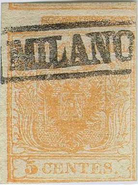
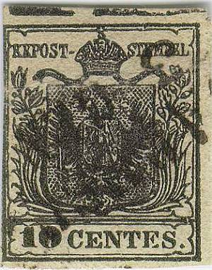
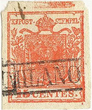
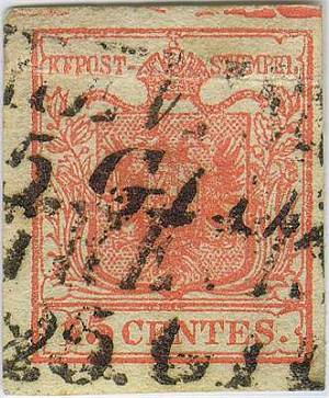
I show here some samples where the marks are very evident (Fig. from 1
to 7).
 |
 |
|
Fig.
1-2: 5 and 10 centesimi with upper horizontal typographic spacing
|
|
 |
 |
|
Fig.
3-4: two 15 centesimi with upper horizontal typographic spacing
|
|
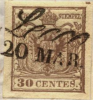
Fig.
5: 30 centesimi with minimal beginning of upper horizontal typographic
spacing
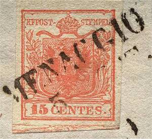
Fig.
6: 15 centesimi with huge lower horizontal typographic spacing
of irregular and jagged type
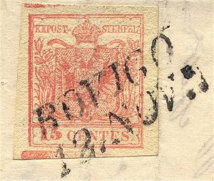
Fig.
7: a very rare 15 centesimi with evident double
typographic spacing upper and lower horizontal